This was done as a student project while at General Assembly.
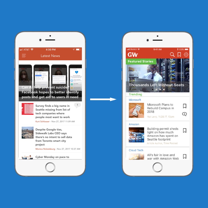
A redesign of GeekWire's current mobile app, focusing on design trends that improve usability issues and great user experience for GeekWire's users.
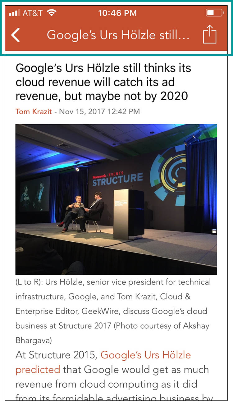
GeekWire is a fast-growing, national technology news site founded in 2011 with strong roots in the Seattle region and a large audience of loyal, tech-savvy readers around the globe, who follow the site for breaking news, expert analysis and unique insights into the tech industry. Though it sees a high usage rate on mobile, it tends to focus on the native web experience versus the app. The mobile app puts their collective effort in the palm of your hand giving you access to all the latest news stories right on your iPhone. Right now, the company would like to understand the current usability problems and obtain recommendation for improvement.
For this concept piece, I worked on a team of three and served as the User Researcher and Usability Evaluator.
This project was completed over a 2-week design sprint.
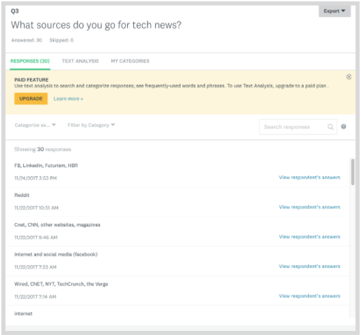
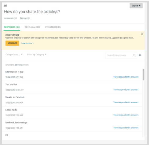
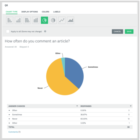
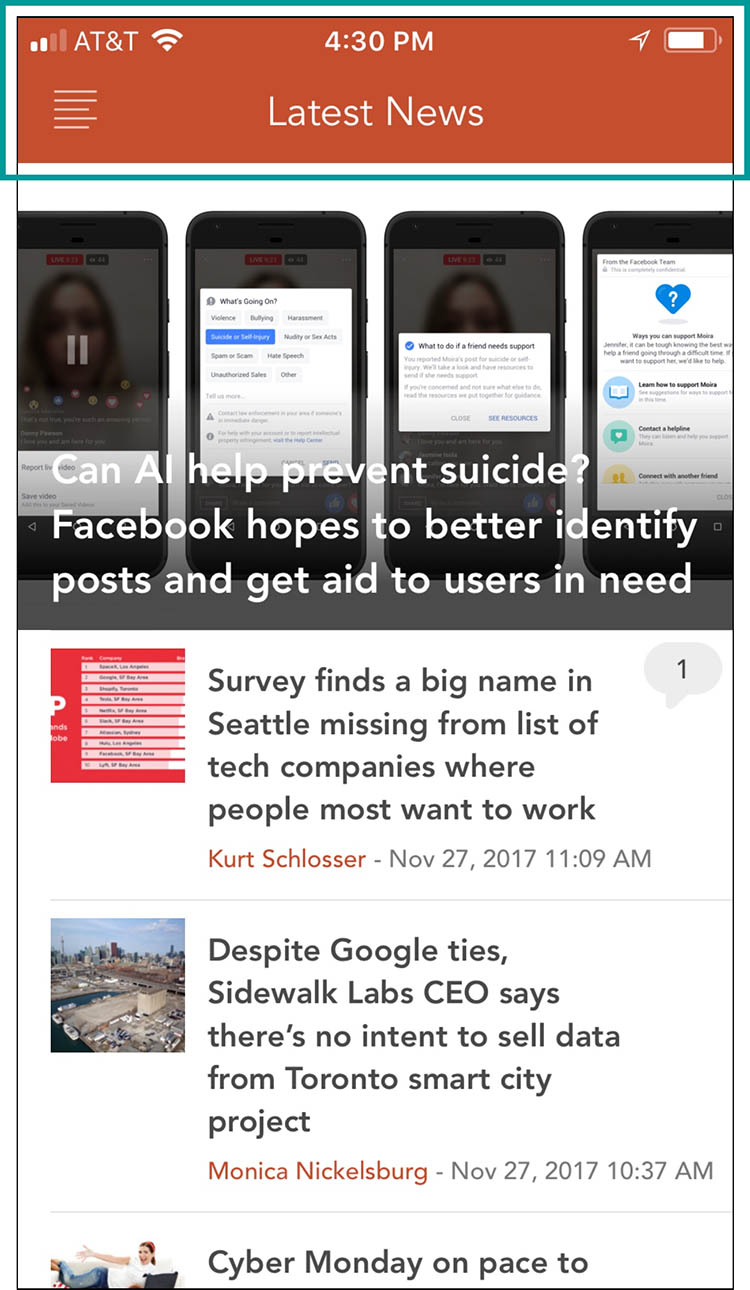
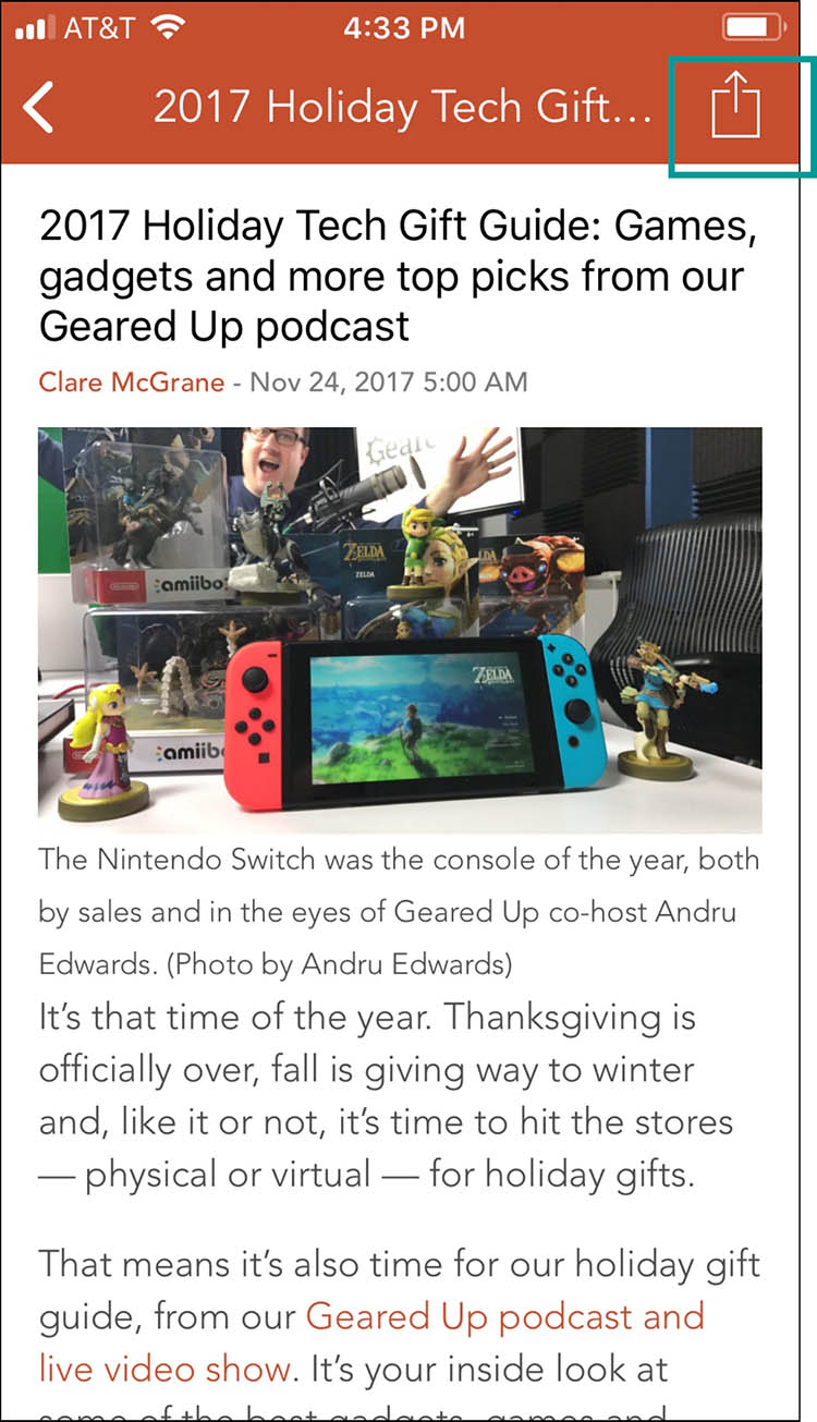
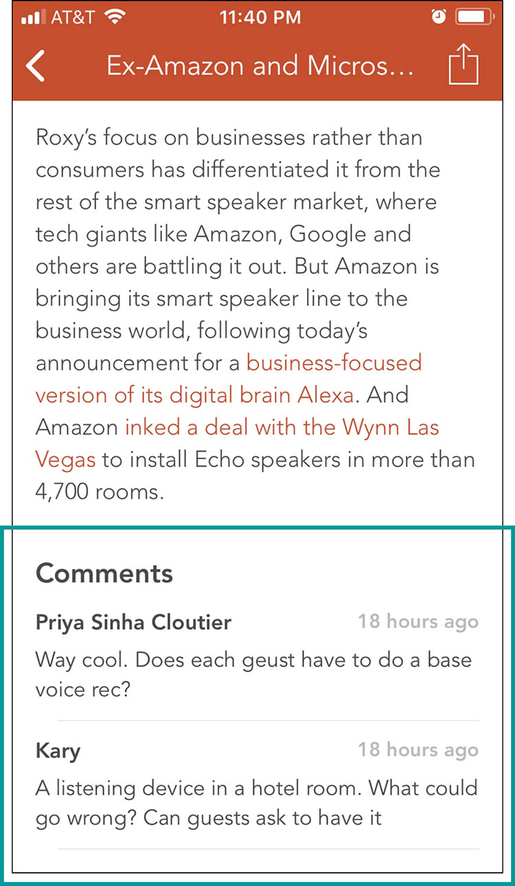
GeekWire mobile app users want to be able to Search an article easily without getting lost in the process. They also want to be able to Share, Bookmark, and Comment on an article within the app.
Currently:
By adding features that make GeekWire mobile app have a clean look and to keep usability simple and easy, users will have a great experience in using the app. Showcasing more of what the website has to offer into the app will keep user returns up and bring in more business.
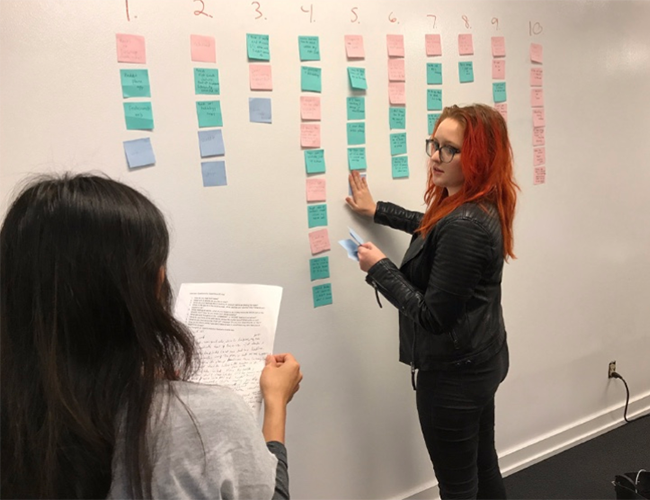
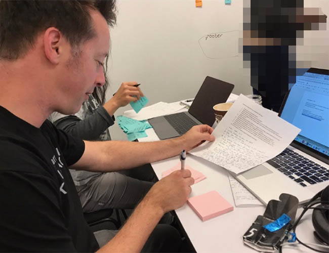
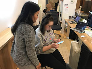
The first three days were spent gathering initial data to better understand the current app and user needs. As a team, we formulated 10 generic questions to be used for interviews among users of technology news mobile app. Being the team researcher, I went out and conducted three in-person interviews.
I also got in touch with one of the founders of GeekWire through email exchanges. I asked him about the history of the company, the branding, logo, and his stand on the current state of the native web and mobile experience.
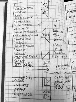
On the other hand, I inquired participants about their experience in using other mobile app for tech news and Geekwire mobile app as well. During the in-person interviews, I also questioned participants about their observations, pain points and wishes for GeekWire mobile app. I took extensive notes throughout the in-person interviews. Together as a group, we synthesized the responses through card sorting. Based on the analysis, we identified 4 primary insights within the current app:
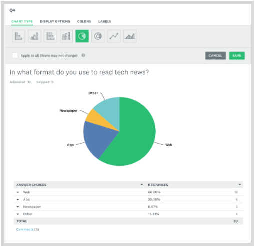
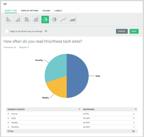
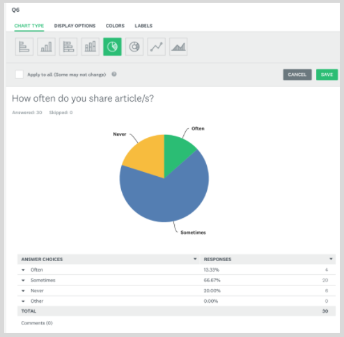
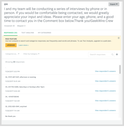
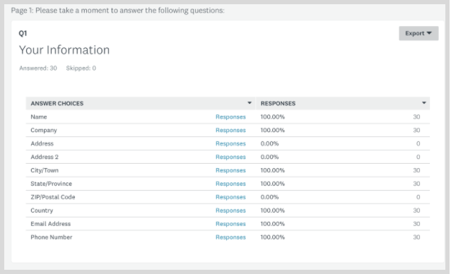
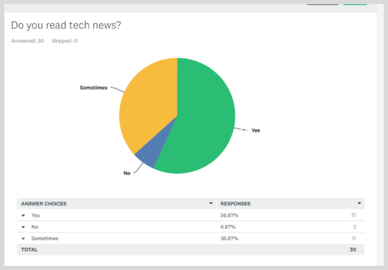
I also spearheaded the sending of Screener Surveys using Survey Monkey. In the survey were 10 questions related to demographic, experience habit, behavior, and participation questions. We had a total of 30 respondents, 14 males, 16 females from Asia, Australia, and North America, ages varying from 20’s to 70’s.
I did an initial competitive market research and came up with this.
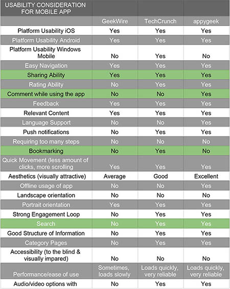
I dug deeper and decided to narrow down the list of the most important features among the 3 competitors. Then I finalized the report with the table below.
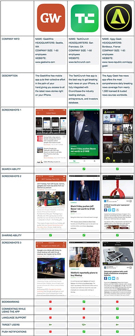
These three apps are one of the biggest when it comes to accessing latest technology news stories, and each has their strengths and weaknesses in terms of how they operate. Which one provides more relevant content? Which one has the biggest reach? Which one is more engaging to the users ? It’s imperative to evaluate and consider some important specs of GeekWire, TechCrunch, and Appy Geek when it comes to designing the mobile app.
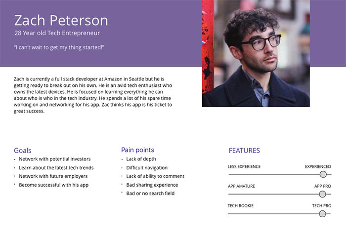
The team and I developed a proto persona based on my initial user research. His name is Zach Peterson, a very busy full stack developer at Amazon. Being a tech entrepreneur, he networks with a lot of potential investors and with future employers. He is always hungry for information about latest tech trends. He wants to be successful with the app he’s developing. As a regular tech news mobile app reader, he gets frustrated when an app lacks depth, has difficult navigation, no comment ability within the app, lacks search field and no sharing features. He likes to share news with family and friends. Unable to do some of those things ruins his day.
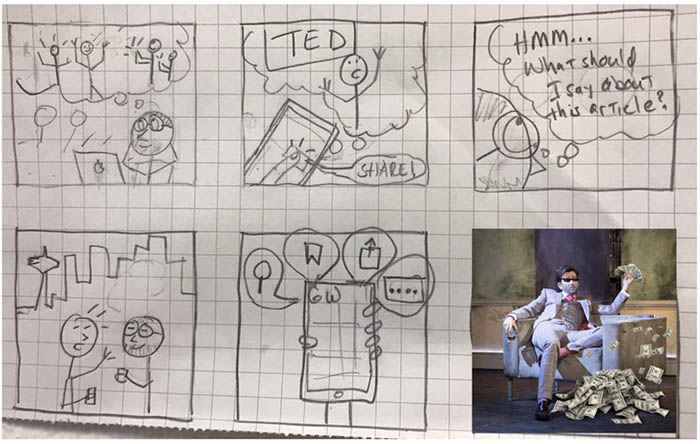
Todd sketched a storyboard to illustrate Zach’s challenges and his future state after the necessary redesign of the app.
Based on the results of user research, I helped in selecting the top three pain points to address in our redesign:
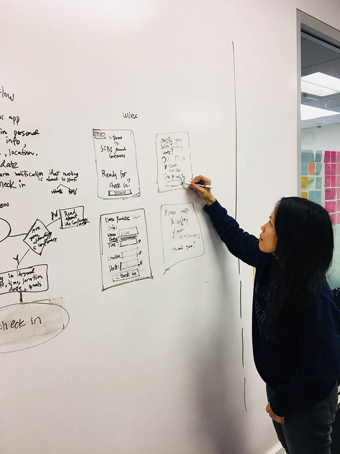
Todd being the Interaction Designer led the creation of some rough sketches for the featured screens. I also provided my input as we did rounds of whiteboarding.
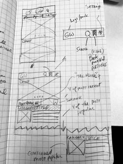
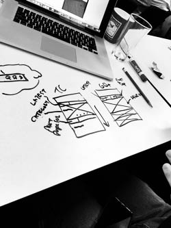
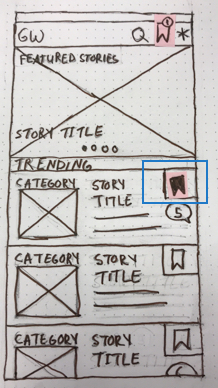
A major feature my group mates and I tried to figure out was the bookmark screens. To generate ideas quickly as a team, we held a design studio. We brainstormed how bookmarking should be done, displayed and it became a major component of our redesign.
My sketches are on the top left. Within 5 minutes, we made as many possible solutions we could think of, then discussed and provided feedback on the reason we did a specific screen design.
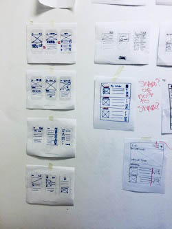
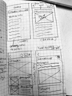
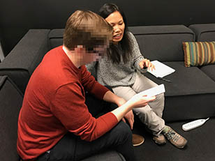
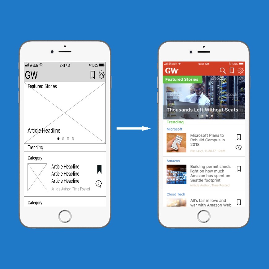
Todd finished up the low fidelity wires. As soon as he was done, he exported the paper prototype into Pop so I could immediately test the designs with users. I did the testing in person and remotely as well. I brought in results from testing and relayed my documentation to Todd and Mackie. Todd incorporated the changes and started designing high fidelity wires.
After sitemap was revised by Mackie, user flow and initial wires finalized by Todd, I started thinking about usability testing. When I was doing usability testing, I used three “almost based on a true story” scenarios I came up with taking into consideration our proto persona’s needs. I realized an additional scenario was also possible without disturbing the original task scenarios. I suggested to incorporate “commenting on an article” since we thought about this important feature from before.
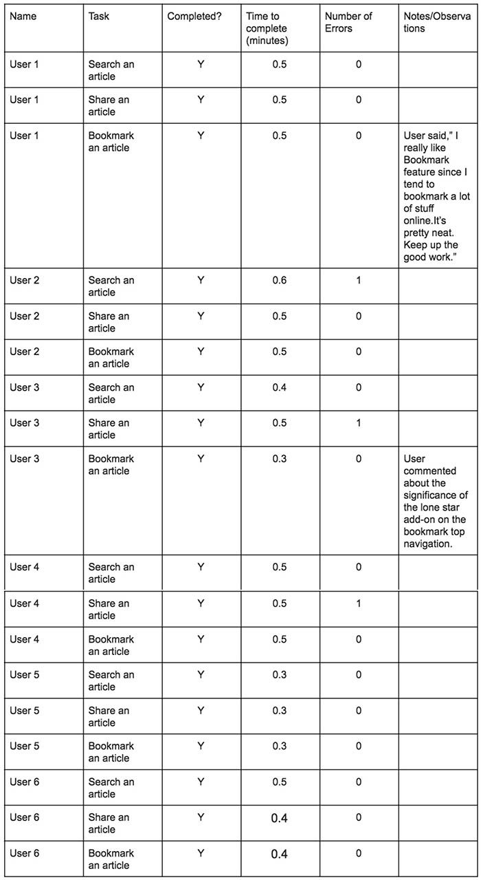
Overall Task Success: 99%
GeekWire Crew
December 1, 2017
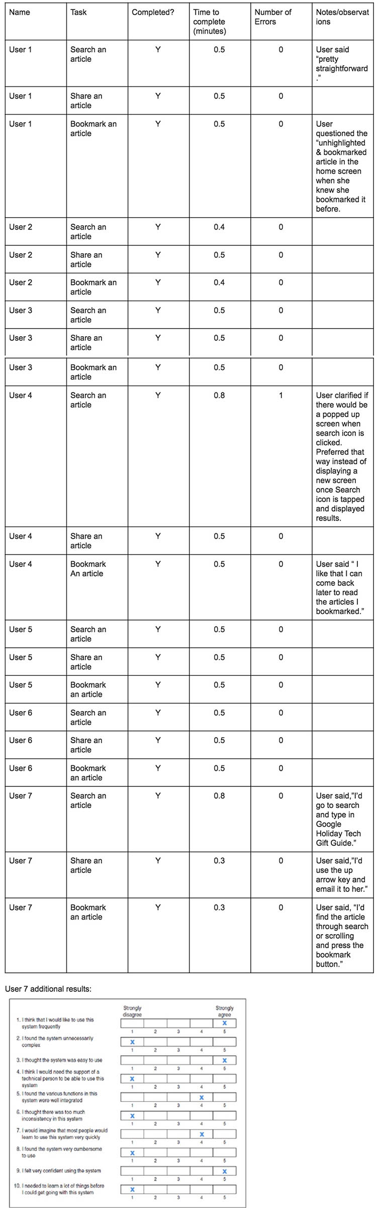
Calculating the App's Usability Score:
Odd # questions score + Even # questions score = (18+20)= 38
38 x 2.5= 95
Post-Test Survey (SUS Score)= 95 Acceptable
How likely are you to recommend this project to others? 8
Problem 1. User 1 questioned the unhighlighted & bookmarked article in the home screen when she knew that she bookmarked it before.
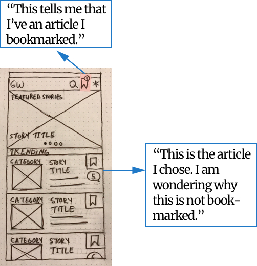
Update/highlight the bookmark icon.
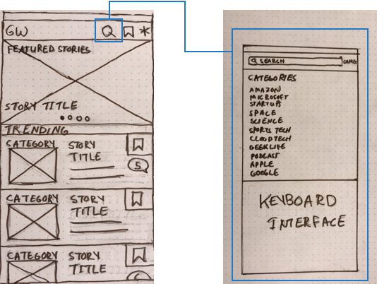
Problem 2.User clarified if there would be a popped up screen when search icon is clicked. Preferred that way instead of displaying a new screen.
Per HIG, a search bar when displayed in navigation bar, can be pinned to the navigation bar so it’s always accessible, or it can be collapsed until the user swipes down to reveal it.
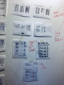
Todd completed the wireframes as I went ahead with testing the designs with users. As I brought in results from testing, Todd incorporated changes.
I went ahead and continued with another round of usability testing this time with the “commenting an article” included. I received a lot of great feedbacks about the Search, Share, and Bookmark features. A few minor issues of the screens had to be iterated. One was related to the ability to comment an article. Originally, we made that feature wherein when a user posts a comment on an article, in order for that post to be seen in social media as well, it would ask the user to login first in whatever social network his/her account is connected to. We realized that some users might prefer posting their comments anonymously within the app. So, we made the necessary changes.
Most people make the mistake of thinking design is what it looks like. People think it’s this veneer – that the designers are handed this box and told “make it look good”. That’s not what we think design is. It’s not just what it looks like and feels like. Design is how it works. Steve Jobs, US computer engineer & industrialist.
Are you working on something great and need assistance? I would love to help make it happen! Drop me a message and let's get started on your project!
Email maryann.n.denman@gmail.com
Address Seattle, WA, United States
LinkedIn linkedin.com/in/maryanndenman/