This was done as a student project at General Assembly.
A redesign of Sixth World Massage Therapy's current website, focusing on e-commerce design trends and great user experience for Sixth World’s users.
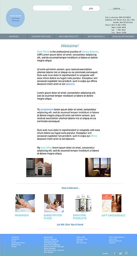
For this project I was tasked to design an online shopping experience for a local business. The design should meet the goals of the persona I’ve chosen, the business, and the brand. I selected Sixth World Massage Therapy which is the professional practice of J.A., a Seattle based licensed massage practitioner. I specifically chose this website because of the business’ proximity to where I live. Also, the current website needs an update. Even though the business has a substantial amount of customers affirming the great quality of massage services it provides, it does not reflect the brand it is presenting in a meaningful way. Considering all these issues helped in the redesign plan.
For this concept piece, I worked solely as the UX designer.
This solo project was completed during a 2-week design sprint.
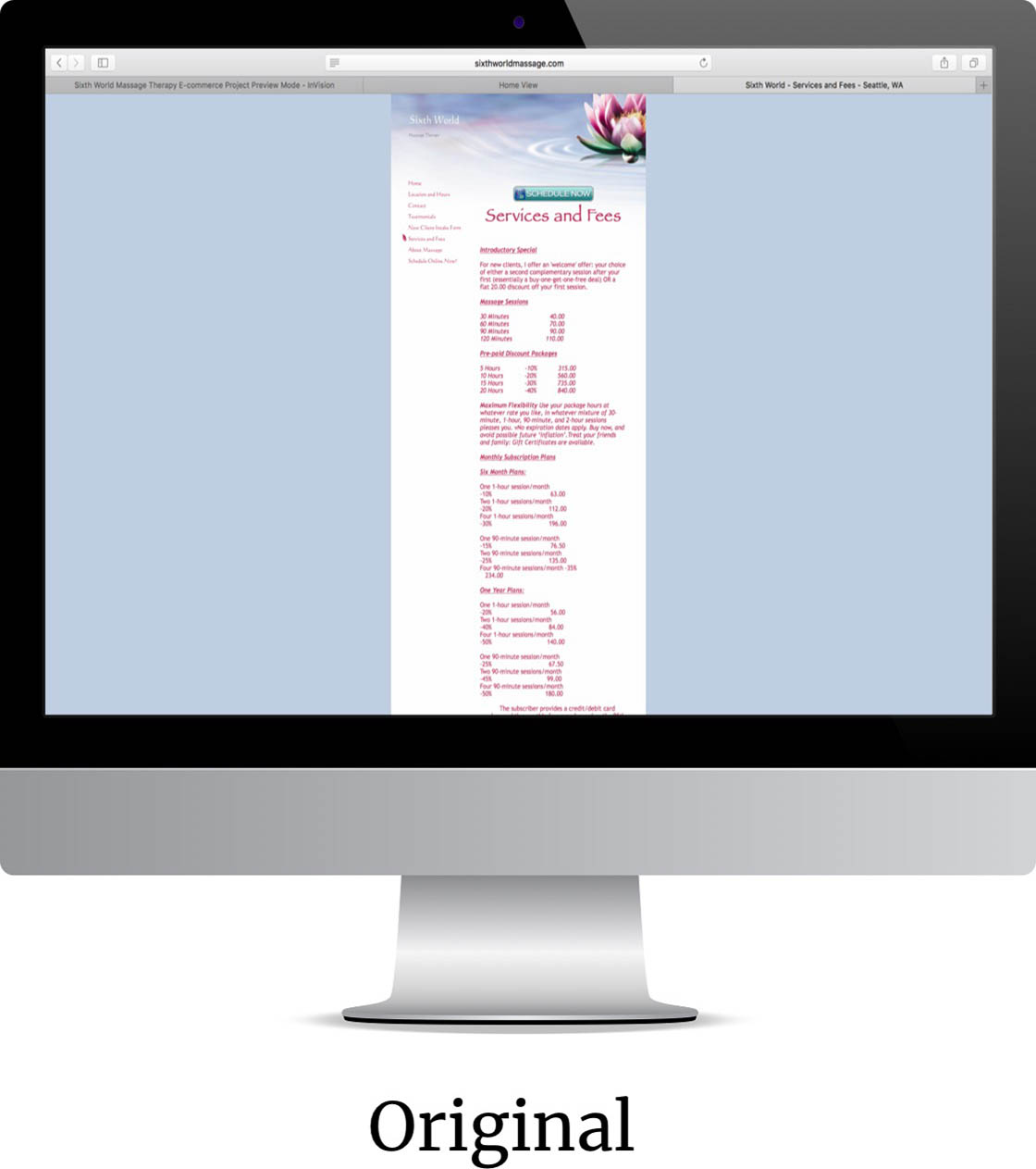
Currently, the Sixth World Massage Therapy website needs an “updating”. It does not have great functionality for finding & booking massage services & products. It needs love & attention it deserves. Also, as a one-man small business it’s trying its best to keep the company afloat.
By simplifying & updating the website through providing great functionality for finding & booking massage services, customers will have a pleasant experience in using the site and will keep on coming back. Sixth World can also increase their e-commerce revenue and entice new clients needing its services & products.
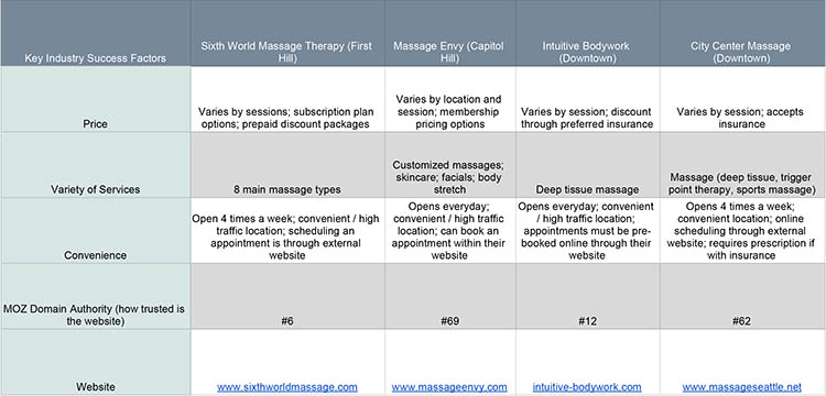
I did a competitor research to help understand better how these businesses operated in terms of day to day operation & website handling. I identified 3 competitors (2 direct & 1 popular brand for a variation).
I compared these 4 businesses according to Key Industry Success Factors & the results helped me come up with ideas on how to better Sixth World Massage's website for customer/user ease of use. Its #6 Moz Domain Authority for instance must meant something. Domain Authority (DA) is a search engine ranking score developed by Moz that predicts how well a website will rank on search engine result pages (SERPS). A Domain Authority score ranges from 1 to 100, with higher scores corresponding to a greater ability to rank.
I interviewed users ages ranging from upper 30’s, upper 40’s & early 60’s, 3 in person & 1 over the phone to gain a sense of their online & physical experience in terms of deciding to select a place to have a massage, scheduling an appointment, purchasing massage related products, & overall customer satisfaction.
I also asked each user to pick 2 websites from the competitor list & to imagine that they were wanting to book a massage appointment, rescheduling it, & paying for the service after. I reminded them to speak out any issues while going through the steps to finish the task. This led to the discovery of any pain points within the massage type selection, appointment scheduling, & checkout process.
Users like (on competitor's site):
Users dislike (on Sixth World Massage Therapy website):
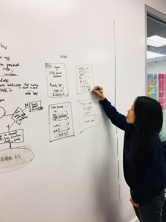
How do I help solve this problem? I started by picking a persona that will represent my target user, which would contextualize specific issues & help me come up with 3 user scenarios. Paper sketching possible scenarios, analyzing the current site map, & making the user flows were next. Testing & iterating my designs followed, which then helped me in designing low fidelity wireframes in Sketch.
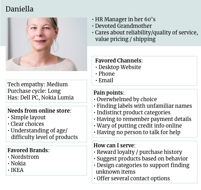
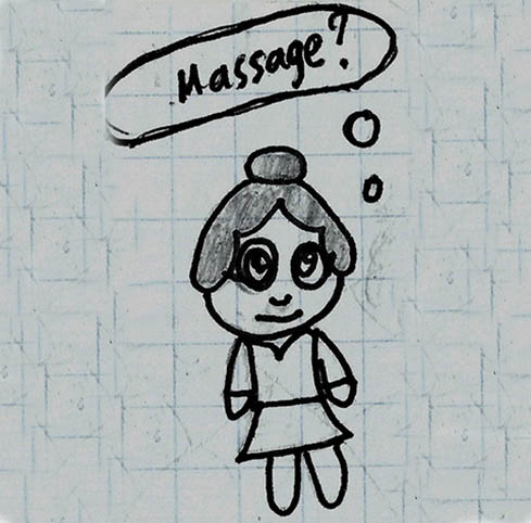
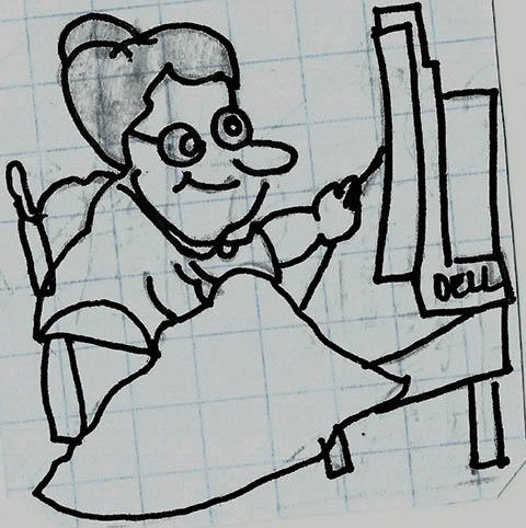
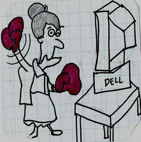
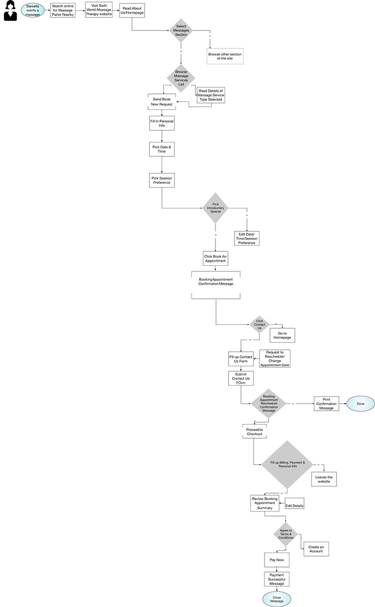
The storyboard started with Daniella wanting to get a massage. She likes to pamper herself once in awhile after all her busy schedule & holiday shopping she’s done lately. A friend from church recommends this great massage place near her work. Daniella goes online & searches for the place. She checks the services & fees and tries to schedule an appointment. Immediately, she’s brought to another website to continue the scheduling. After she picks the kind of massage & session she prefers, she’s being asked for her email address. She’s overwhelmed with all the steps she has to go through before she can even book an appointment. She’s also wary of putting her personal info in that scheduling website. She closes her pc & makes a call. No one answers the phone.
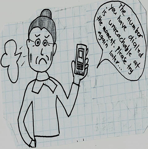
Daniella abandons her quest & left with frustration & more body aches that she can remember. How do I help improve Daniella’s shopping experience considering her online shopping needs? With that in mind, I designed a solution that would allow her to have a great experience as she goes through the website to look, book, & pay for massage service as painless as possible.
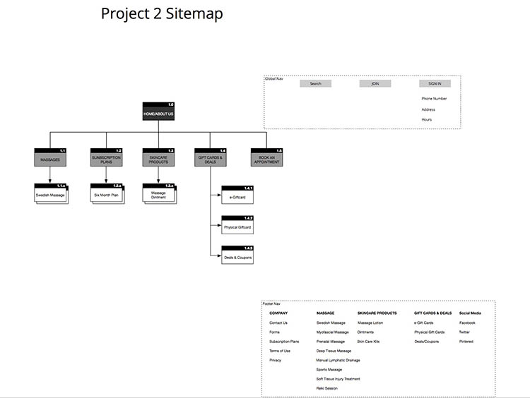
I made a simple revision of the current sitemap & came up with this:
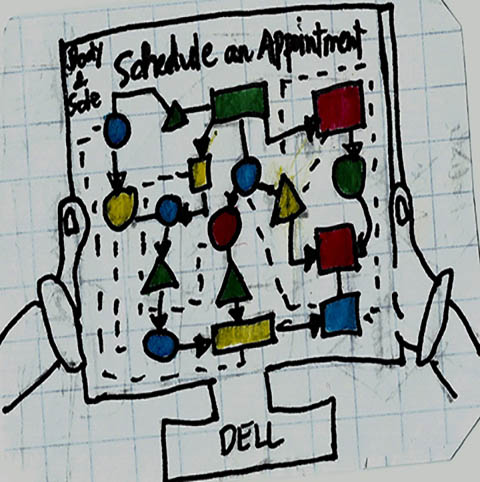
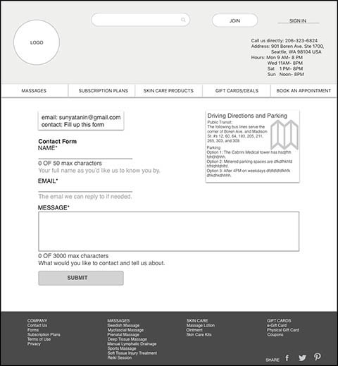
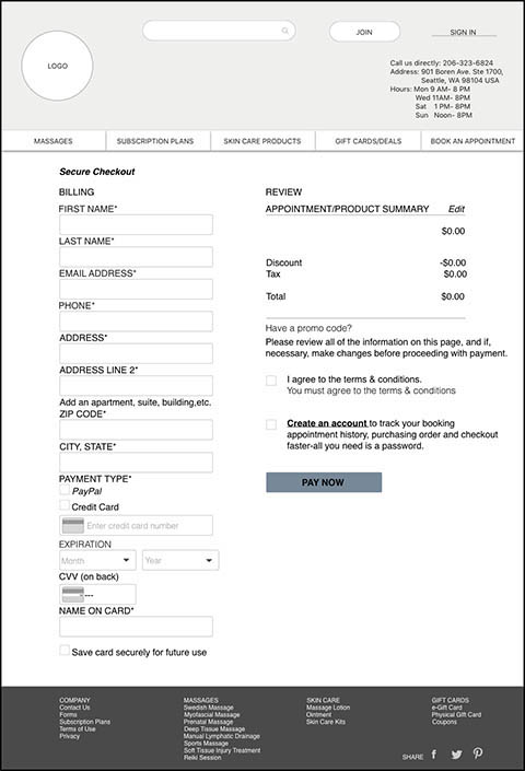
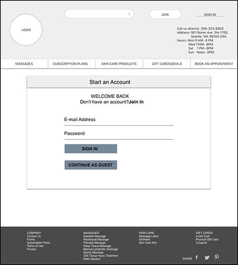
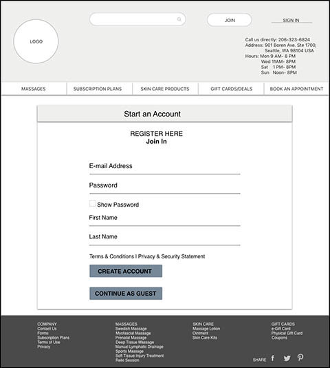
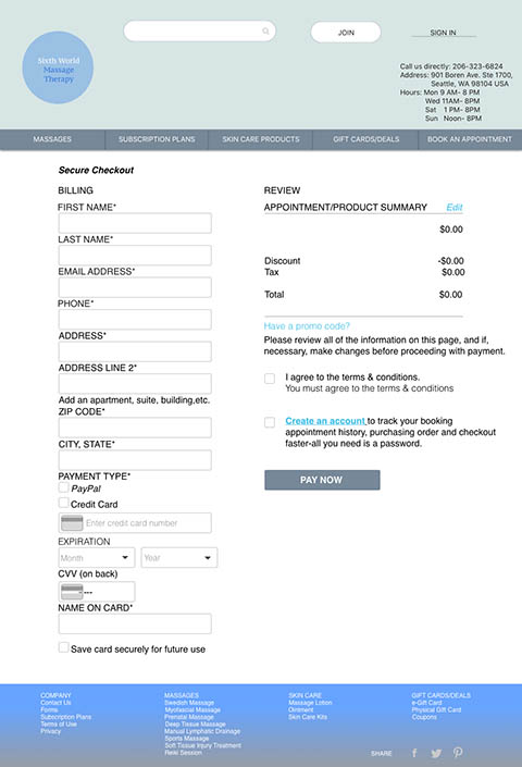
I developed a potential user flow Daniella might take through. Here it describes the experience she makes in deciding how to navigate through the site. The flow starts when Daniella is wanting a massage. She searches online to look for massage parlor nearby. She then looks up for Sixth World Massage Therapy website per a friend’s recommendation. Next flow focuses on the product/massage types discovery. It is followed by her booking for an appointment & lastly contacting the business to reschedule the appointment. I realized the flow feels incomplete without including a simple guest checkout process.Guest checkout is one of the most liked features per user interviews I did. The current site does not allow that at all.
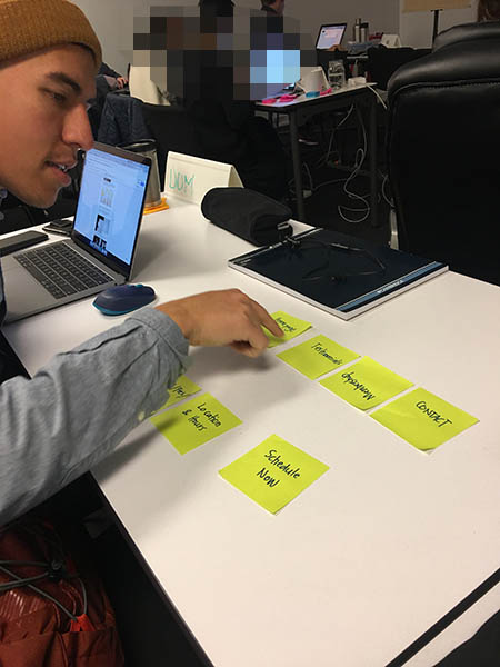
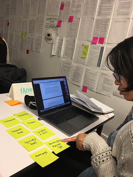
A card sorting was done with a few potential users which led to the creation of their mental model & helped with information architecture. While observing the users in their approach to arranging and designating, this paved the way in the recreation of the site’s navigation & sitemap.
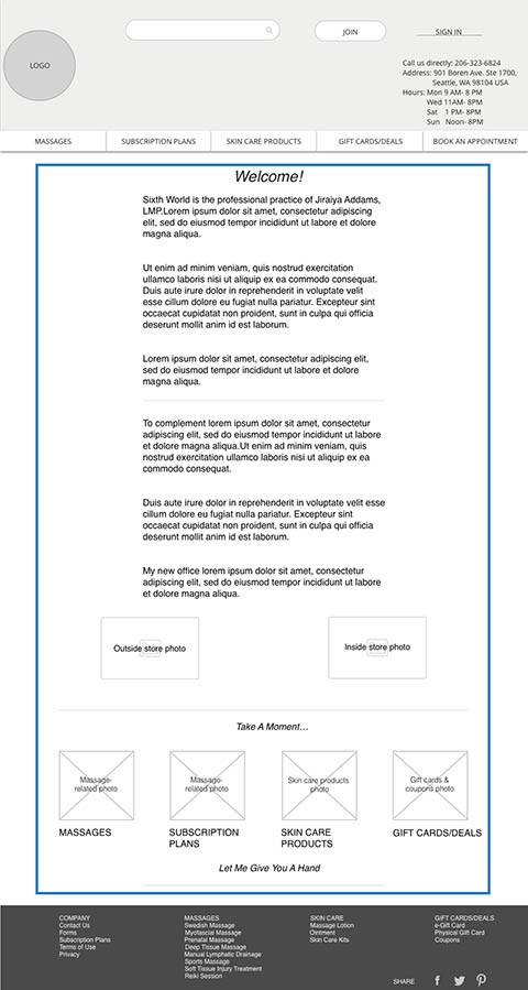
I wanted to highlight the site organization in general while focusing on the e-commerce solutions as well. The intention was to help improve some of the issues users mentioned with the present website.
I started with rough sketches. Early design concept was inspired mostly by Massage Envy and a little of Zeel and other massage websites but eventually moved to a unique and simplified user experience that Sixth World Massage Therapy could embrace.
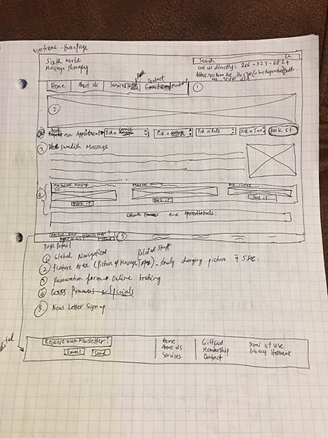
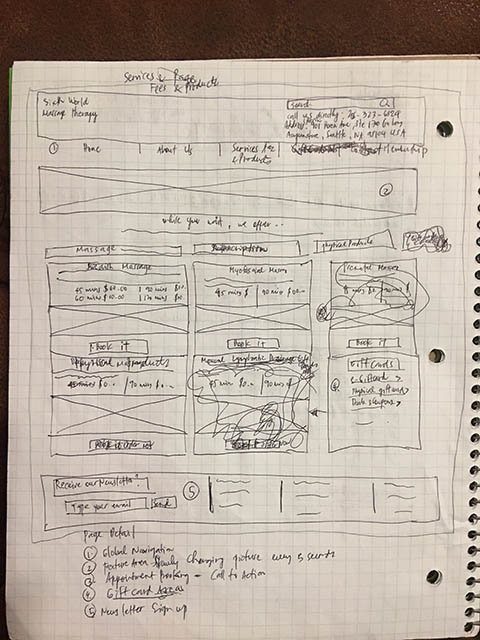
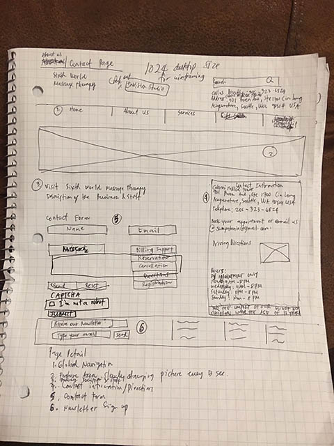
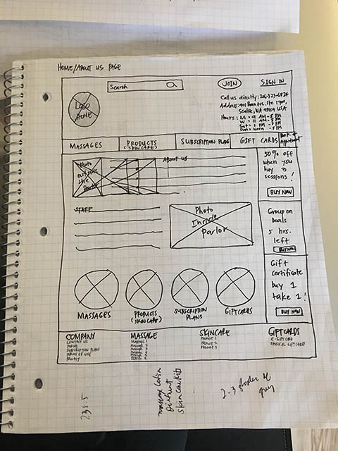
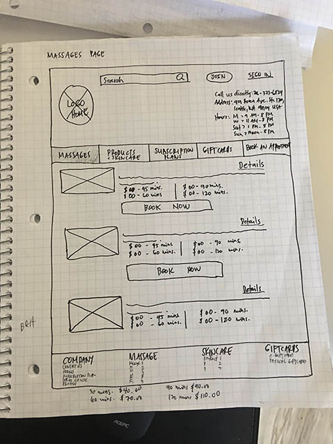
When I figured out the primary screens in my sketches, I began converting them into digital wireframes to prepare for testing.
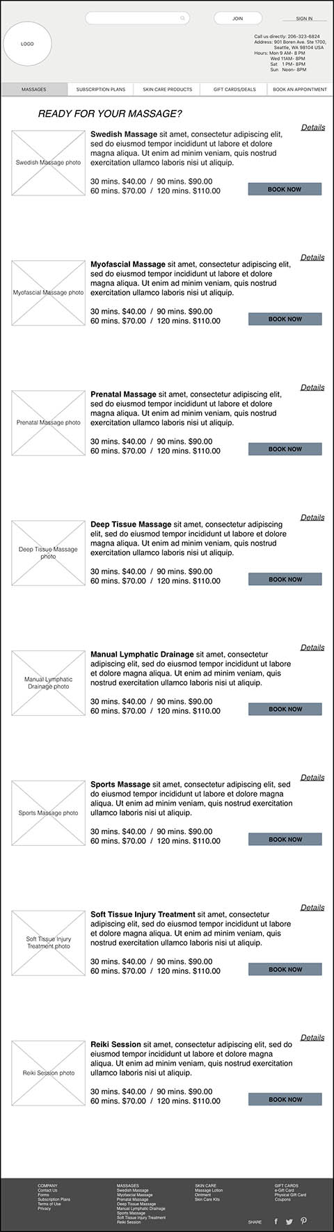
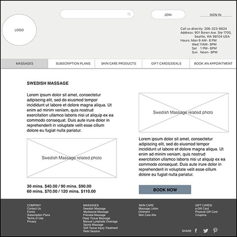
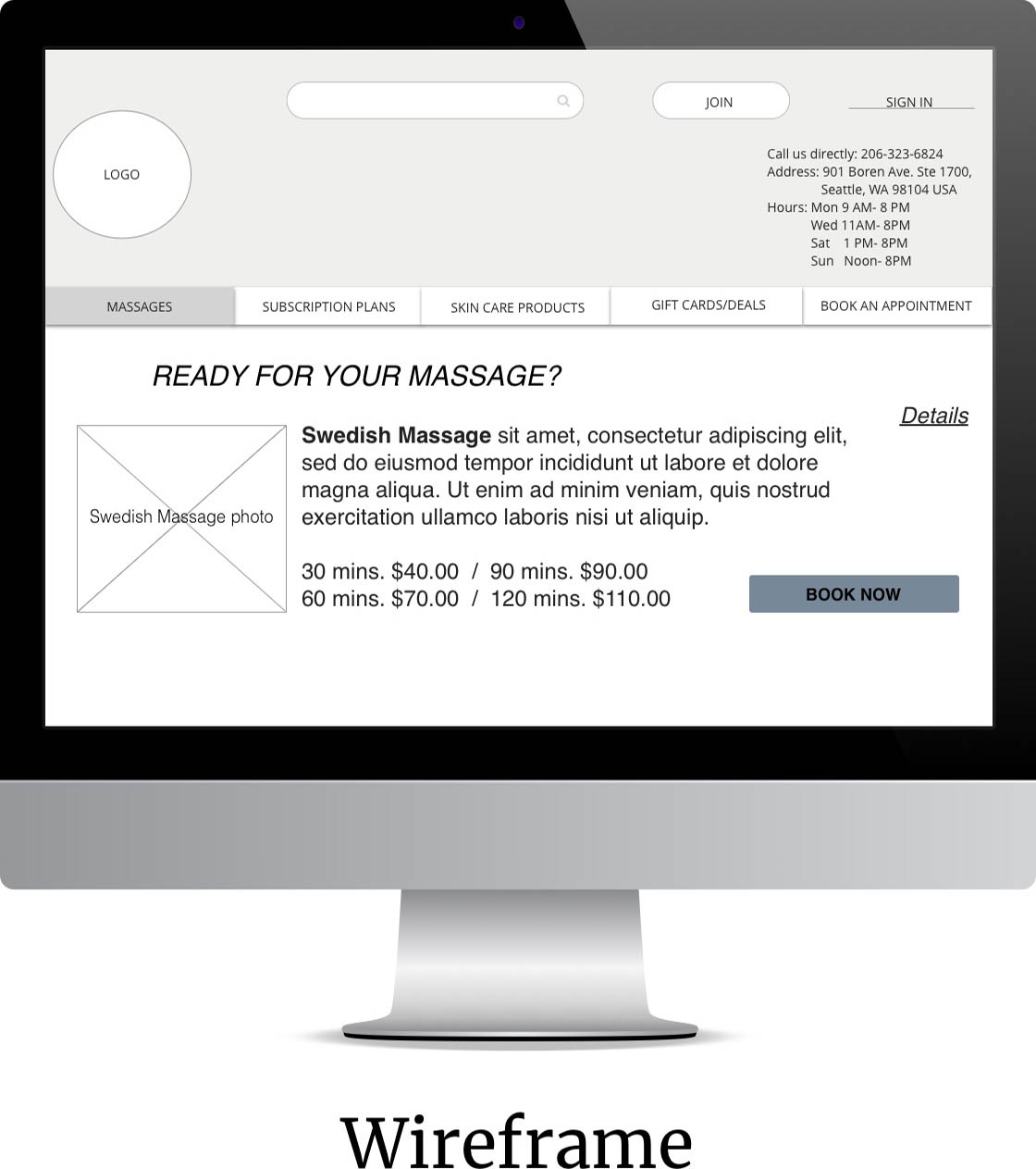
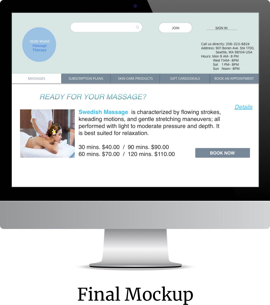
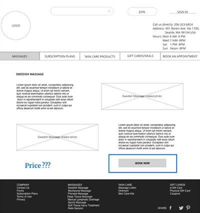
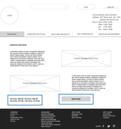
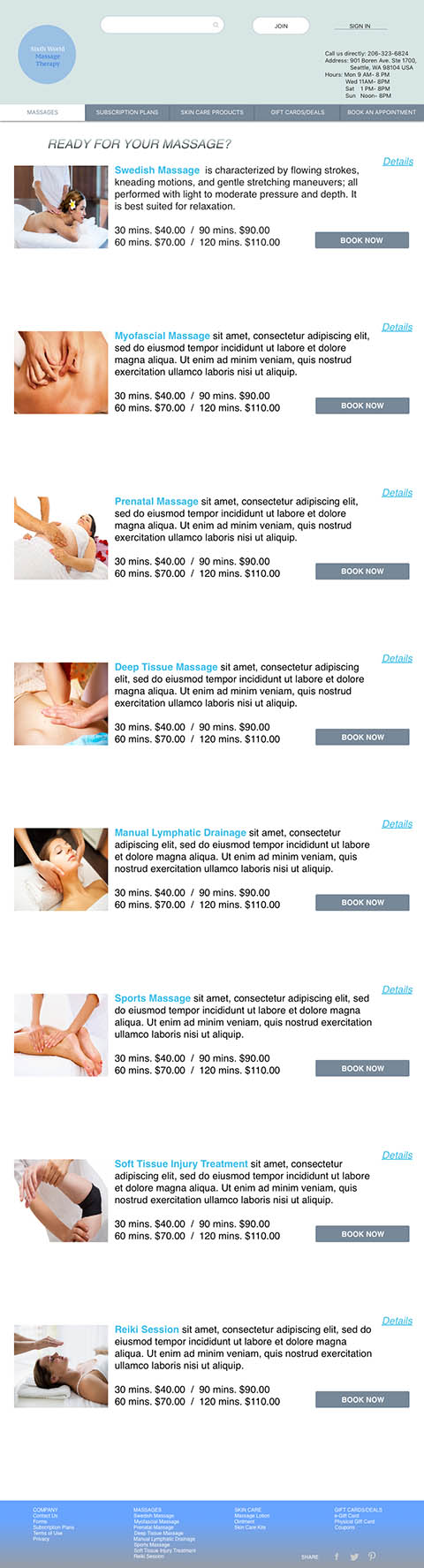
Product Discovery Flow. 1.) Home Screen 2.) Upon clicking “Massages” in the primary navigation, Massages page will display 3.)When clicking “Details” in the upper right corner of each massage type listing, details/description page will show up
Price and Session preference were missing in the product detail page. “Book Now” button was way too far to the bottom right of the product detail page. These were some of the pain points my users encountered in testing this section. I made the necessary changes.These were actually good suggestion of the users as affirmed by my research.Price and button matter.Price has been named as the most important factor affecting the online purchasing decision by the 60% of all online shoppers worldwide. This number is even higher in emerging eCommerce markets. As for button, tiny mistakes can cost business dearly- in fact one poorly designed button might cost $300 million as the Jarod Spool mentioned.
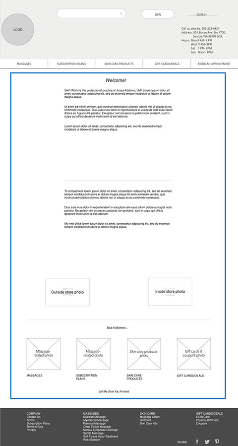
One of the users I tested mentioned that reading through the Homepage especially was a little hard to read because the texts were too small. Going back to my persona, this would not go well with Daniella. I adjusted it to readable size. Making this adjustments was also understanding my target audience, the message I was trying to communicate, and what I wanted them to do amongst other things. Font size impacts both accessibility and usability.
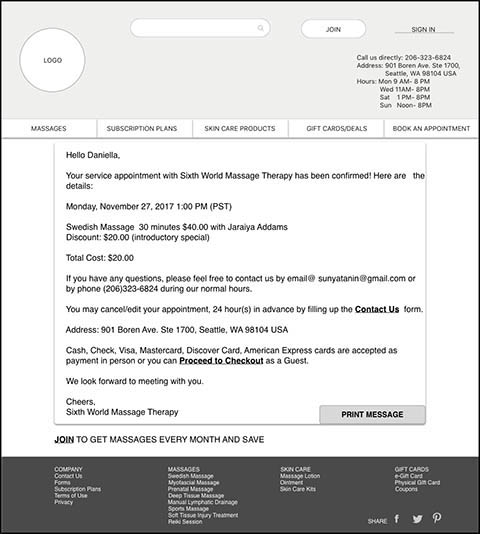
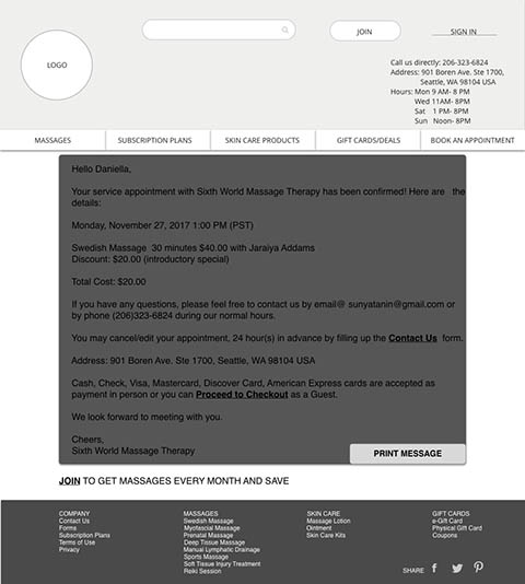
Designing the Booking Confirmation page to make it personalized and customized was one thing. Reading and understanding the message was another. One of the test participants commented that reading through the booking confirmation page might not be a good experience because of the dark fill color I’ve chosen. Contrast fail. Sticking to white and calm colors always stood out. It is worthy to note that even though this was a minor change, color is an important form of communication. It can sway thinking, change actions, and cause reactions.

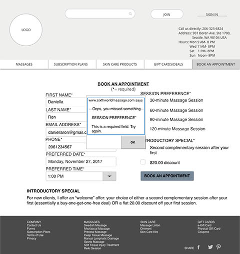
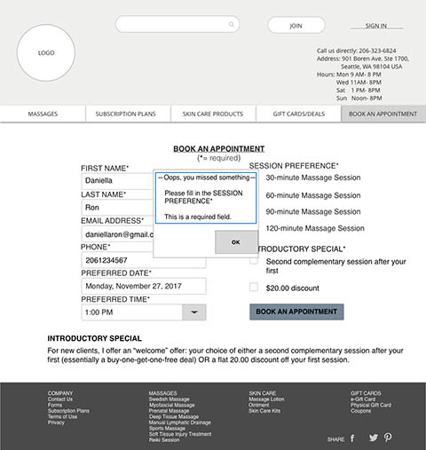
The importance of the URL in the pop-up screen was questioned by one of my users. It was also mentioned that the message prompt was unfriendly and too demanding. I made some updating by removing the URL and rephrased the message to a more empathetic way by adding “Please”.
Doing this project was a humbling learning experience for me. Every step of the UX process is equally important to the others.Without a solid UX design process, a designer could be completely moving in the dark. A clear and concise UX process, on the other hand, makes it possible to craft amazing experiences for users.Here are some of the takeaways:
Most people make the mistake of thinking design is what it looks like. People think it’s this veneer – that the designers are handed this box and told “make it look good”. That’s not what we think design is. It’s not just what it looks like and feels like. Design is how it works. Steve Jobs, US computer engineer & industrialist.
Are you working on something great and need assistance? I would love to help make it happen! Drop me a message and let's get started on your project!
Email maryann.n.denman@gmail.com
Address Seattle, WA, United States
LinkedIn linkedin.com/in/maryanndenman/