This was done as a design concept for a client.
Design of Loss Prevention Tools, with emphasis on an MVP focusing on user research wireframes, clickable prototype, user stories, and flows to validate client's approach for a new loss prevention web app.
Loss prevention professionals who work specifically in small to medium size retail companies are finding it hard to effectively upload & analyze data for specific internal theft categories with a tool that is price-effective & tailored to their specific needs.
For this concept piece, I worked on a team of three and served as the Information Architect, Visual Designer, and Project Manager.
This project was completed over a 2.5 week design sprint.
Loss Prevention Tools is working to build a digital tool geared toward retail loss prevention to assist loss prevention experts with analyzing data and case management.
The goals of the web app design:
We will create a platform that loss prevention experts can utilize to upload data, filter the proper categories, analyze the results, and conduct investigations in a time-efficient manner.
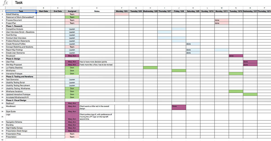
To manage the team in terms of task assignments and project plan creations, I made a spreadsheet as suggested by fellow team members. It guided me in conducting daily check-ins to make sure every task decision related to the project was on track. A team meeting was also conducted prior to releasing everyone to do their assigned tasks. The purpose of this was to review the list of tasks, deadlines, client, and team goals.Lastly, doing all of these provided that big picture road map for where I am taking the team and how we are going to get the end goal.
The team and I compiled a list of questions about the company, business goals, and asked the client during kick off meeting. The responses gave us great insight about the client and his specific goals for this project.
"I will identify how loss prevention experts currently analyze retailer data to pinpoint internal theft by conducting telephone and in-person interviews & compiling the results."
Lauren came up with the Research Problem Statement before the team collectively decided on a Problem Statement because of the fact that the company does not currently have a product. The research would be significant in informing us the right target users and designing the MVP.
Lauren, being the lead researcher did a competitive research to gain more insights about loss prevention tools that the industry professionals use. Results showed that most tools in the market are expensive and offer features that are more advanced.
The first 5 days of the project was spent with research.Even though Lauren was the head researcher, it made sense to help her in looking for the right target audience and conduct interviews. First, I went out with the team for initial interview with store managers around nearby businesses during daytime. Secondly, I went to 4 stores still in downtown (All Saints Clothing, Carhartt, Ross, Barnes and Noble) asking the Loss Prevention managers with 17 formal questions and recruited them for testing later. So far, I managed to interview 2 successfully. None said yes for the testing.
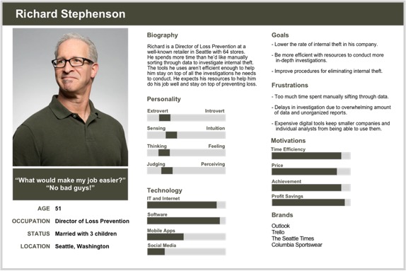
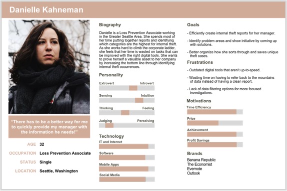
Lauren developed 2 proto personas based on the initial user research. Richard, being the Director of Loss Prevention, was our primary user and Danielle, the Loss Prevention Associate, was the secondary target user.
Loss Prevention Tools should provide the following to greatly accommodate our proto personas:
The persona and scenario development helped to keep us on track as a team and prioritize the features to be added to the web app. It also helped us in creating a particular flow a user might possibly take.
As the visual designer, I sketched a storyboard to illustrate Richard’s challenges in using the current loss prevention tool his company provided.
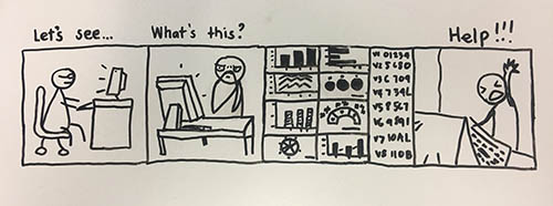
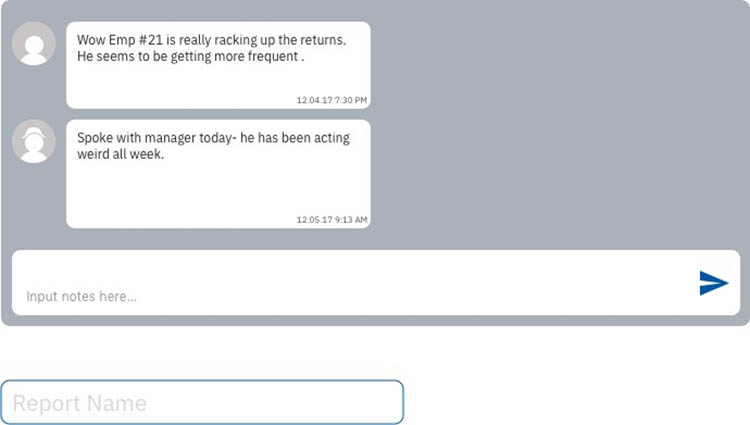
This is based on a story of a Loss Prevention Director who happens to be Richard; he wants to investigate an employee and uses the POS data that is fed into the security system to determine if that employee is committing fraud/theft. So you can see Richard is extremely overwhelmed with the amount of data he is looking at. He does not want to manually sift through the data. He needs help.He is so frustrated & he throws his hand up in the air.
With the solution statement created, I continued the storyboard with this:
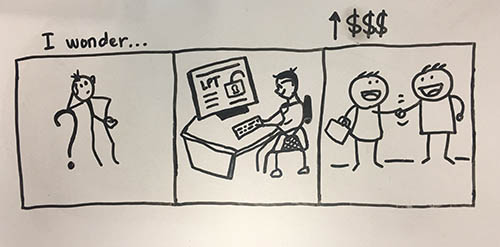
You can see Richard here wondering about a better tool on the market that will help him analyze data and manage cases. Later, you notice him using the less complicated and straightforward Loss Prevention Tool web app with a big smile on his face. Helps him better in analyzing internal theft efficiently. He’s happy. Because of that, Richard and the store are able to preserve profit and prevent losses. So, happy store owner!
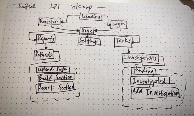
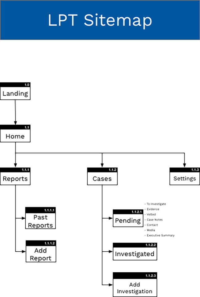
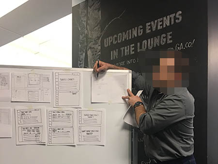
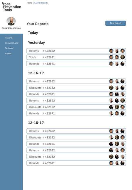
My teammates and I agreed to consider the layout of the web app simple. With that and the research findings in mind, I being the information architect made this sitemap. I wanted to create a simple and logical site structure that can help users achieve their end goal, and to allow them to easily understand how to navigate, giving them a positive experience. I started with some sketches on paper before I came up with the final one.
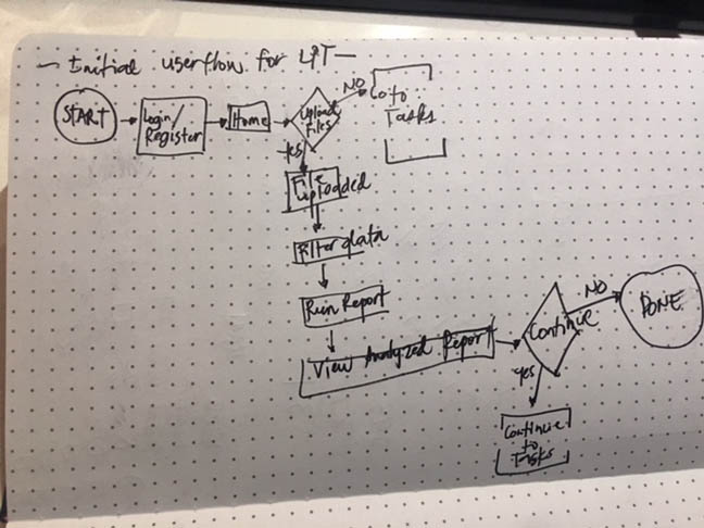
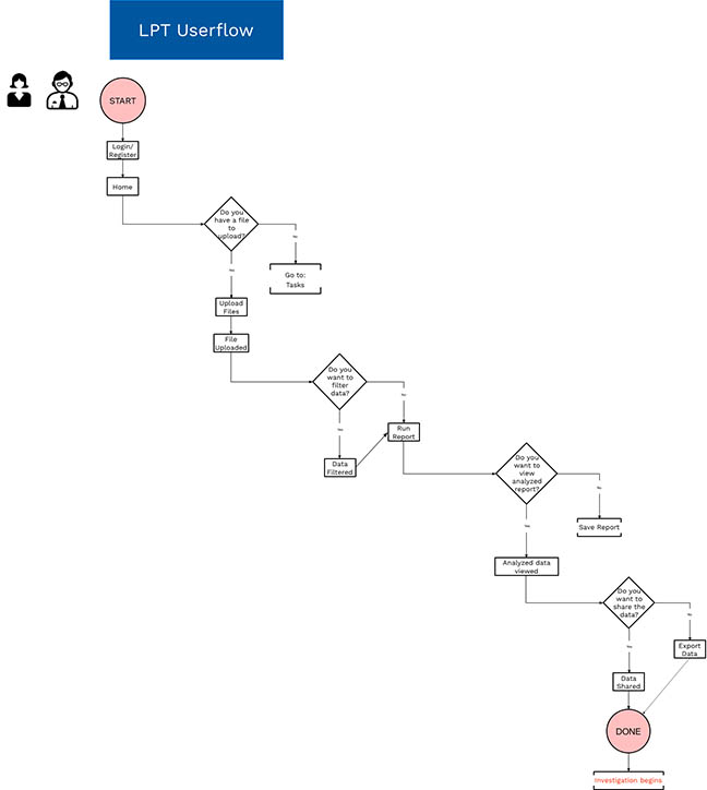
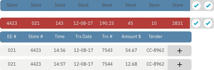
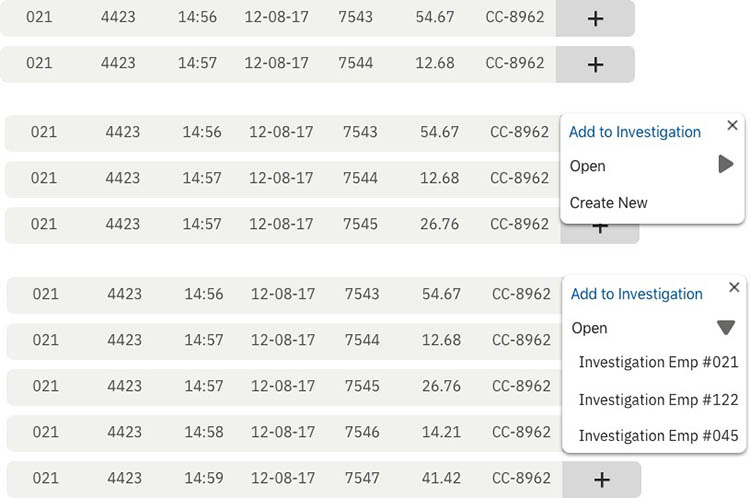
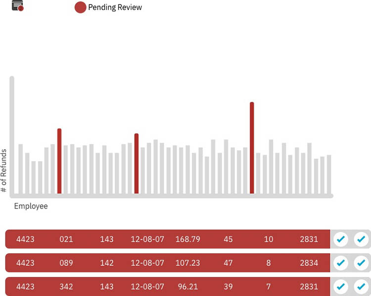
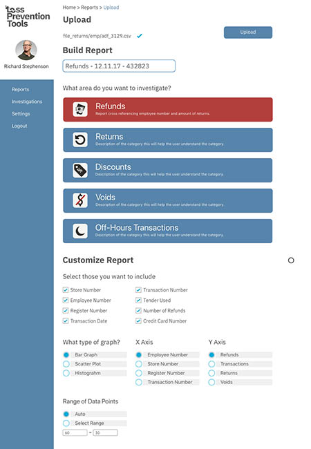
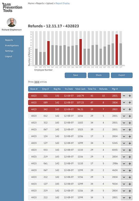
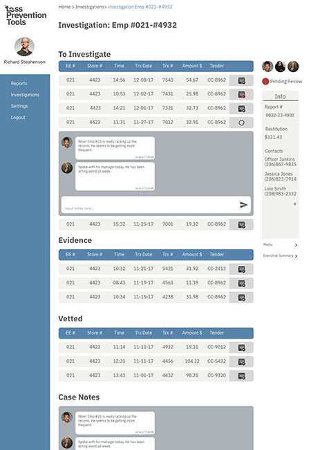
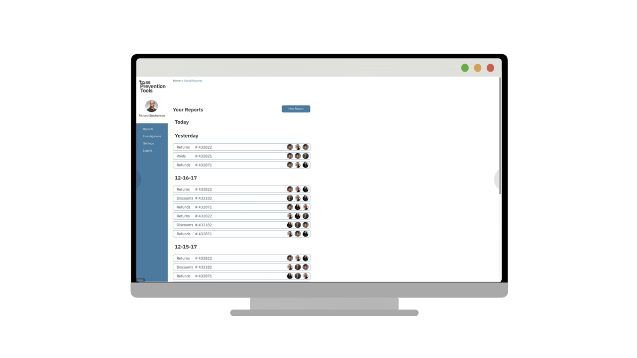
After some analysis and careful thought, I went on to develop a user need’s focused flow which can help Richard and Danielle to complete their task, achieve their goals and feel better about it. Tasks include uploading a file, filtering data, running report, viewing analyzed report, saving it, sharing the data and exporting it. I started the initial user flows in paper and finalized it via OmniGraffle.
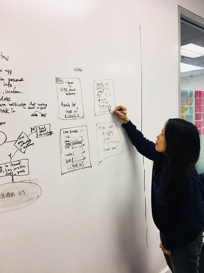
Dom as the Interaction Designer led the creation of some rough sketches for possible featured screens. I also provided my input as we did rounds of whiteboarding.
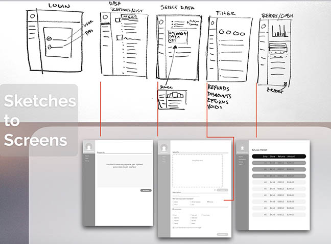
A major decision my group mates and I thought of was to conduct a design studio led by Dom. The purpose of this was to understand the client's views and to clearly define the key screens the web app needed. It was a vital brainstorming, and learning experience for myself and the team as this helped in knowing what major components needed to be displayed for the web app design.
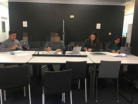
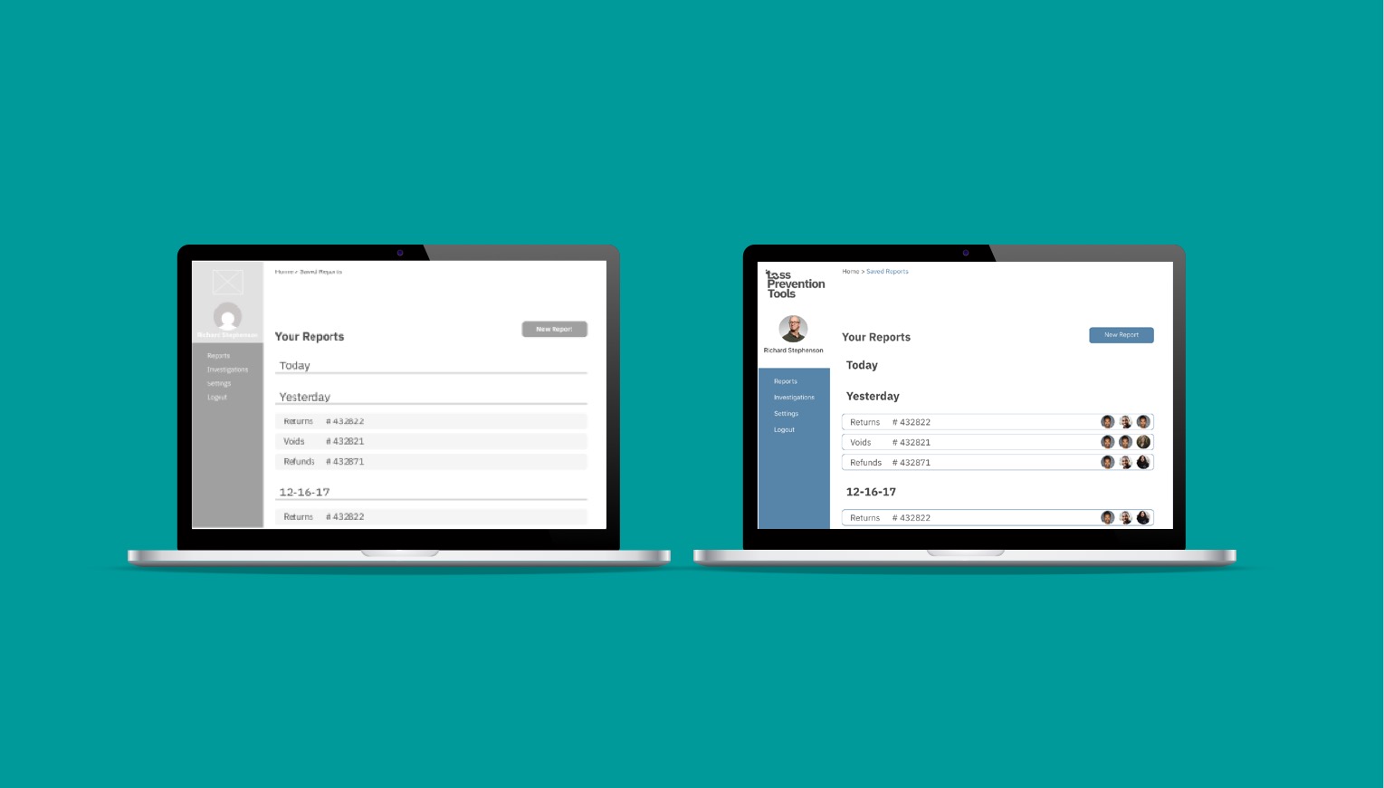
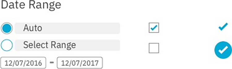
As the interaction designer, Dom made the initial wireframes. As soon as he was done, he handed it over to Lauren for initial user testing. We had a total of 4 user tests. It was challenging to find the target users. It was more hard to convince any available Loss Prevention Specialist to test the screens. But luck was on our side and was able to get someone to try it. Lauren led the user testing by sending the link to a user and then asking the user to go through it while talking out loud over the phone for any concerns, ideas and more. I recorded the conversation using my phone while Lauren and Dom took notes on the other hand. We did this process 3 times. We were also able to conduct 1 in-person user testing. I was very fortunate to find this person at the right place and at the right time. After Lauren relayed the documentation results from the user testing, Dom incorporated the changes and started designing high fidelity wires.
Takeaways from the User Testing:
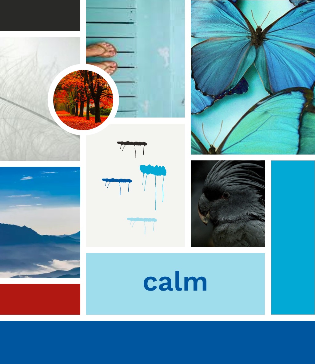
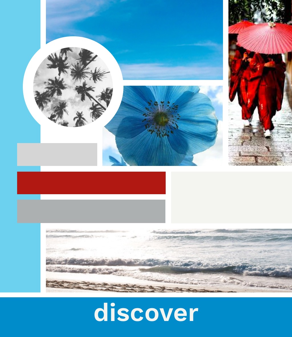
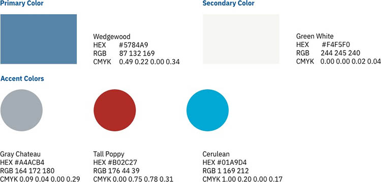
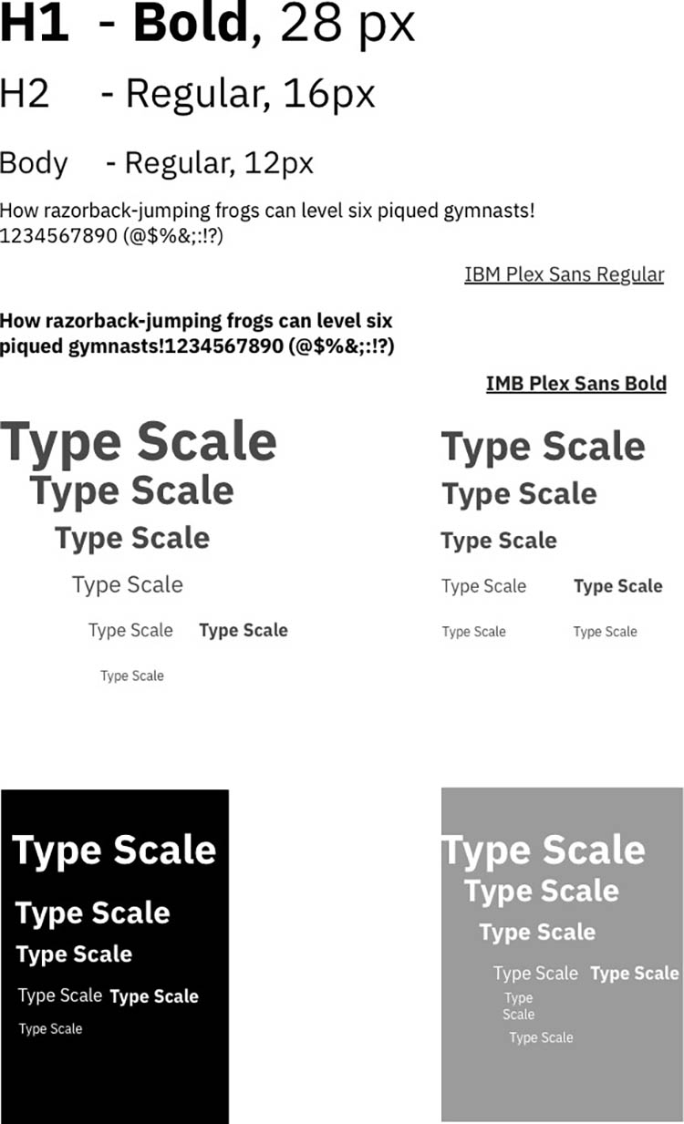
As the Visual Designer of the group without any good background of visual design, I had to challenge myself by doing the “Branding Challenge" I found online. This helped me in incorporating the right colors, typography and more into the wireferames. Here is my report:

Most people make the mistake of thinking design is what it looks like. People think it’s this veneer – that the designers are handed this box and told “make it look good”. That’s not what we think design is. It’s not just what it looks like and feels like. Design is how it works. Steve Jobs, US computer engineer & industrialist.
Are you working on something great and need assistance? I would love to help make it happen! Drop me a message and let's get started on your project!
Email maryann.n.denman@gmail.com
Address Seattle, WA, United States
LinkedIn linkedin.com/in/maryanndenman/